Light Lines
by Ryland Walker Knight
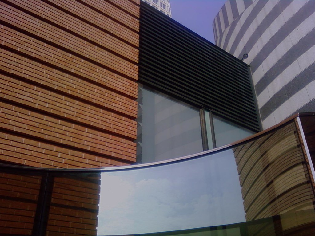
—in.
Way back when I said my favorite art "forces you to rethink space, and how light rhymes." I think that has stayed true. Now I'd say my attraction to geometry is something about control, and limits, and maybe even the limits of control (despite Jim Jarmusch's own way-back-machine movie from last year). The point is that I enjoy that order, though I also want to bend it, jam it, crowd it. Above all, as ever, selection is key; i.e., how we frame things matters. I'd like to think these selections show how I feel San Francisco to be a complicated, at times over-determined space. The more I live in this city, the more it feels horizontal, yet it's got hills on end. Seems every corner you turn in this city you'll get a new horizon, a new angle—and in such a small sweep! See more of my SFMOMA trip in this flickr set.
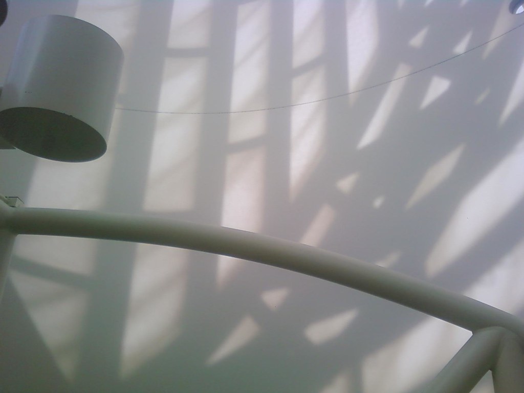
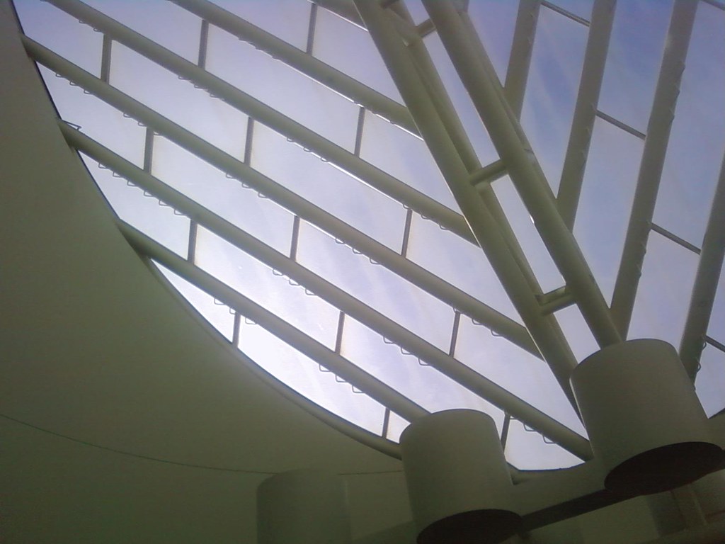
—up.
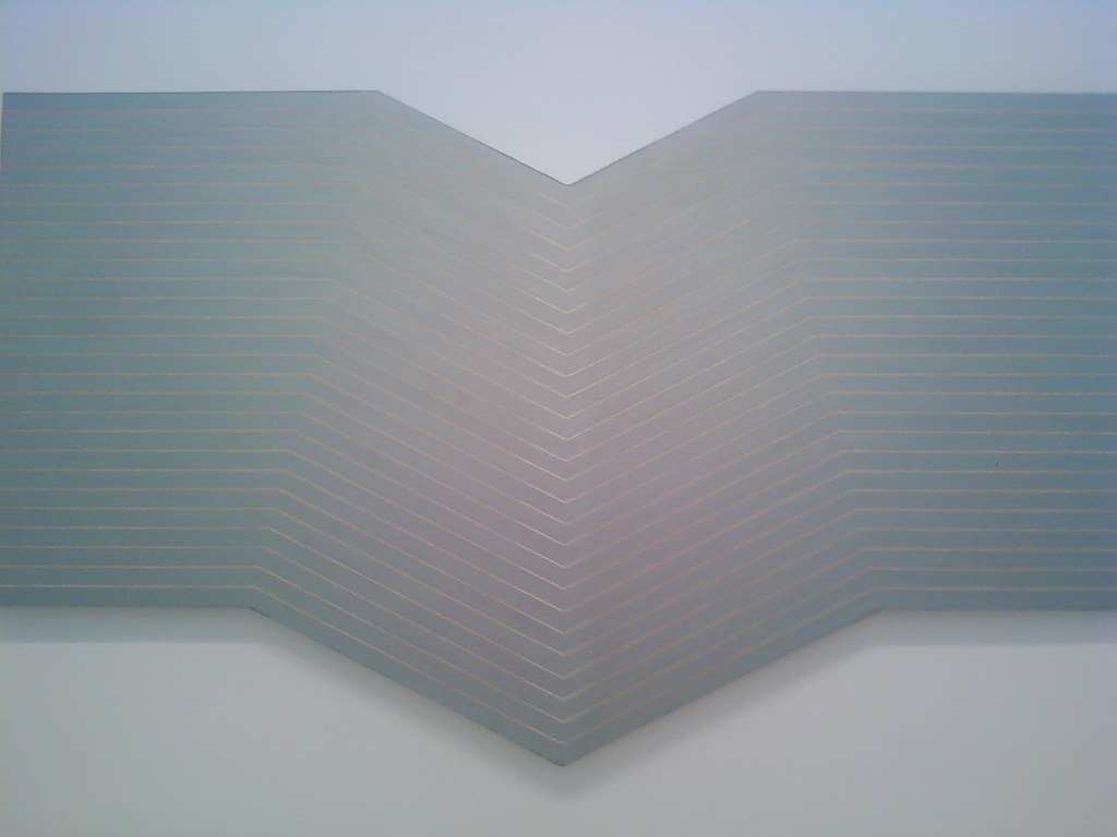
—down.
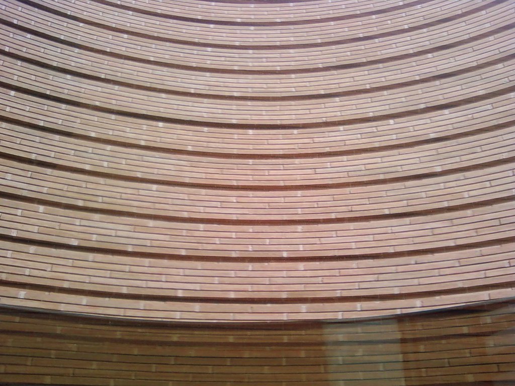
—around.


Ryland, I really like this blog and your photos... may I ask what kind of camera you're using?
ReplyDeleteThanks, Mike. And you may: as it happens, I'm currently shooting most of these pix with my cellphone's built-in camera (I own and operate an LG Shine). But when I find batteries again I'll be using my Canon Powershot A570 IS. Again: thanks for reading.
ReplyDeleteWhen I was about 15, I saw Antonioni's "The Passenger" and it totally bowled me over, as I sough more of his work I too started to notice space and architecture that are so important in his films.I love modernism even if in the UK it is misunderstood as "brutalism", and Price Charles still seems to have the power to stop developements by having a word in a friends ear.
ReplyDeleteoops! that should read "Prince Charles"
ReplyDeletewell, to be fair, i'd say a lot of the so-called 'brutalism' in the UK looks a lot more brutal than some of the so-called 'modernism' in the US/elsewhere... something about the sky. also, varied textures help things to not be so brutal, or more inviting at that.
ReplyDelete